Pattern / Card
A customizable pattern and elevation system.
-
Partnering with a senior engineer, I was responsible for leading discovery, visual design and documentation.
-
Module
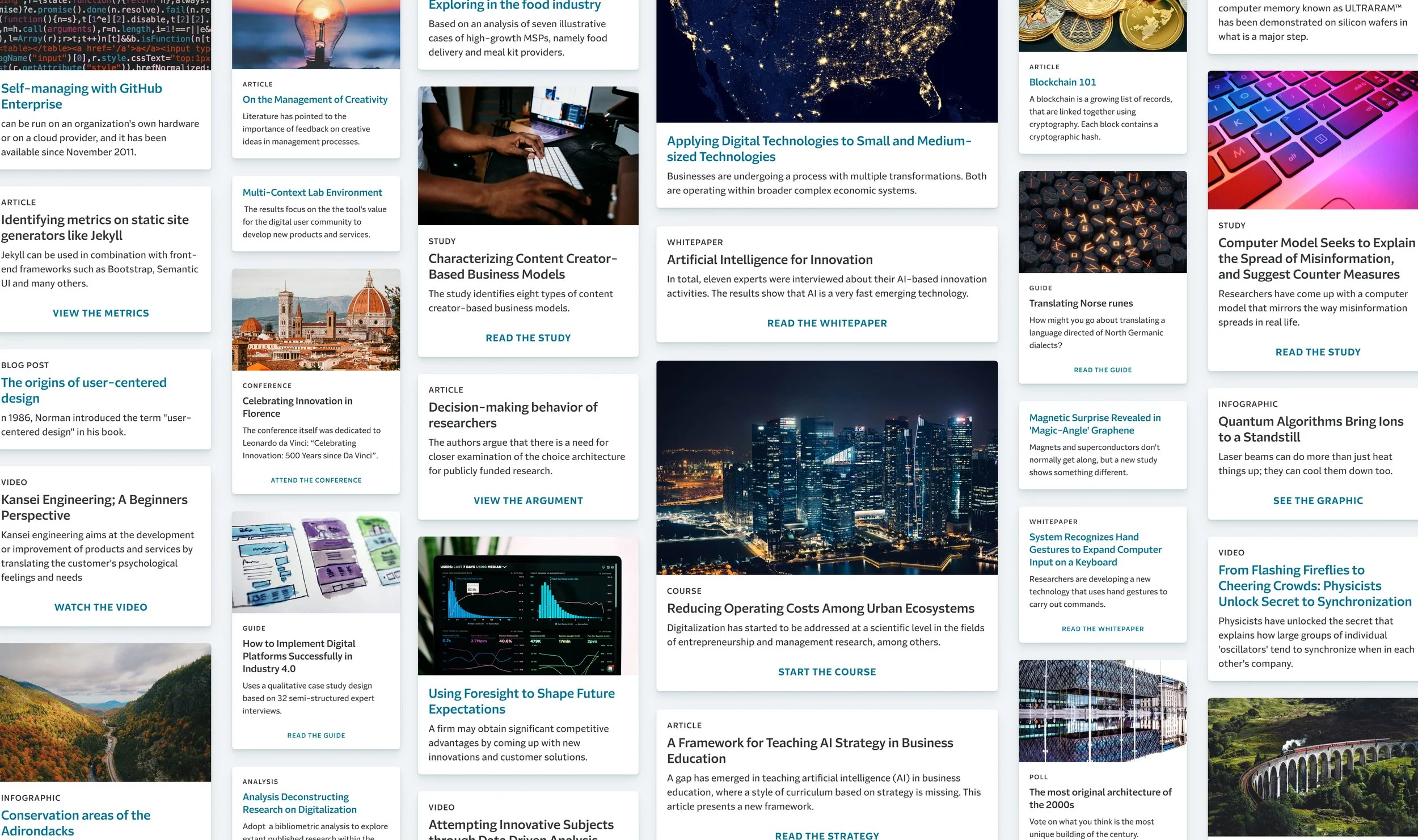
As a highly requested pattern that would be used throughout the enterprise, cards needed to start with a solid foundation.
Discovery with the Pattern Canvas
Using the Pattern Canvas, we diverged on what cards could be and converged on what we should deliver. Just a sample of some of things we learned:
Cards can make people feel at ease because pages are simpler to navigate. On the other hand, cards can make people also feel overwhelmed if there are too many to process.
There needs to be a clear visual call to action on the card, preferably using buttons or hyperlinks.
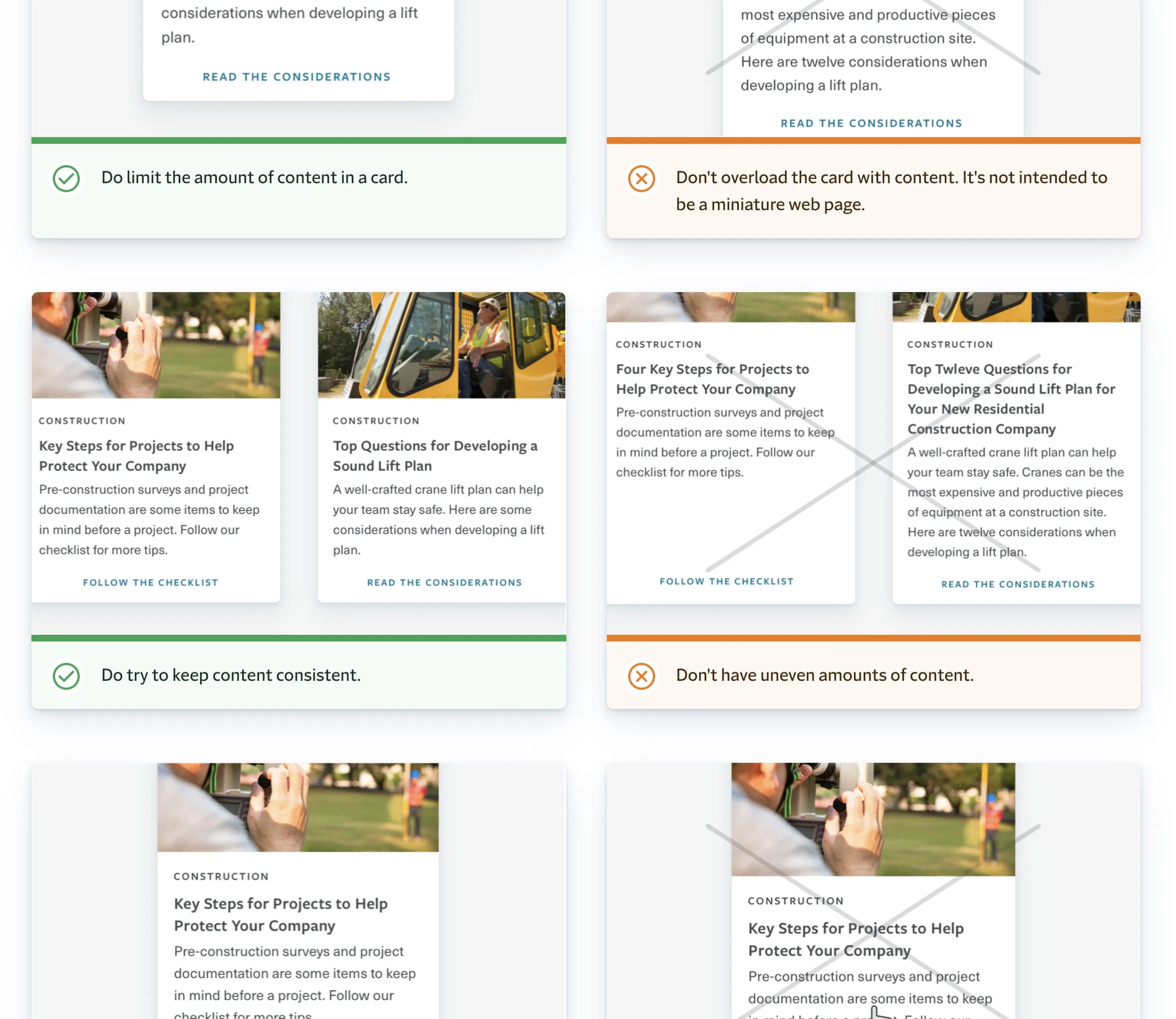
Keep information short and to the point. Cards shouldn’t be mini web pages.

Early visual explorations
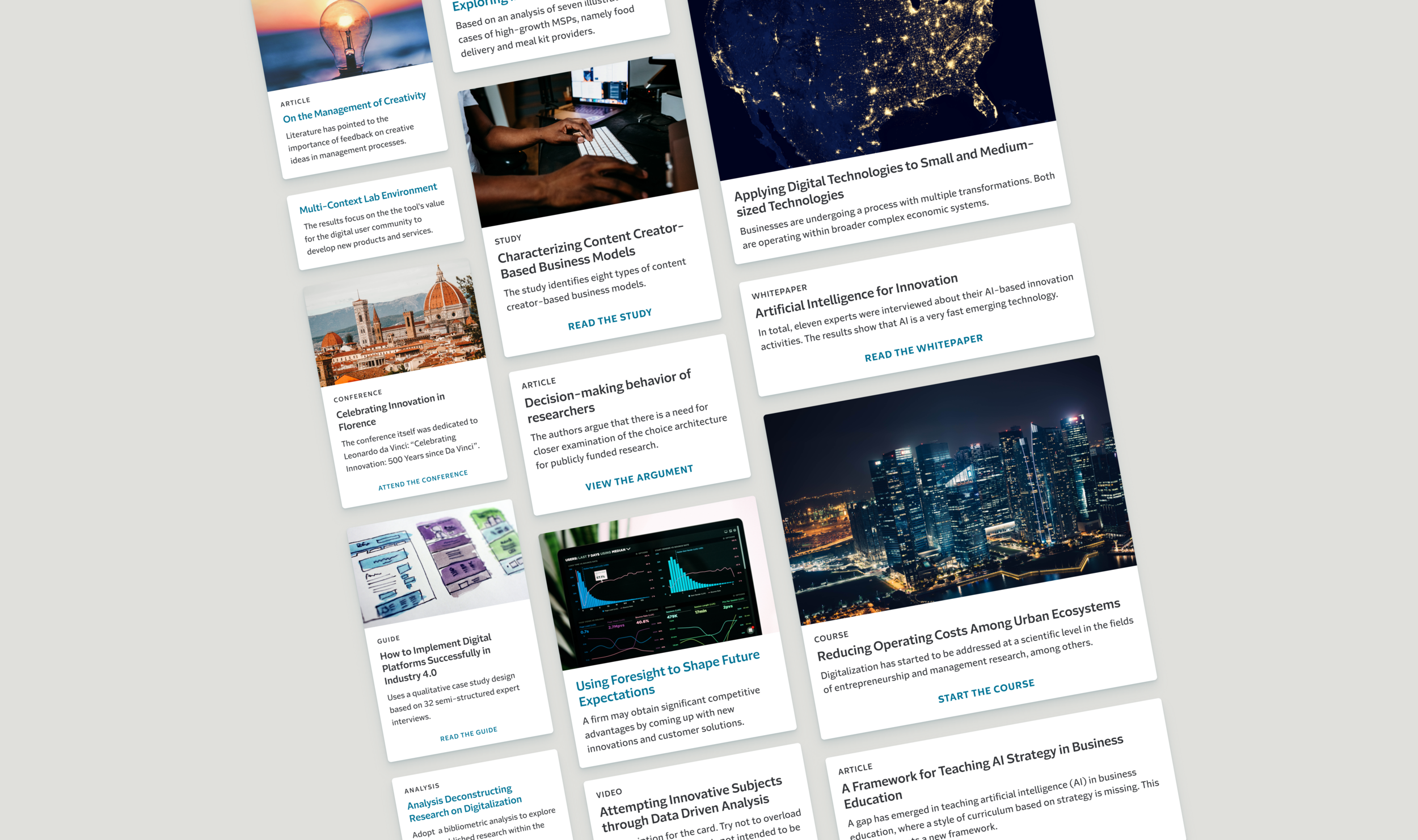
Coming out of discovery, we decided to focus on delivering “content cards”. These cards contain content on a single subject and allow users to access more information. The visual appearance would used as the foundation for future variants.
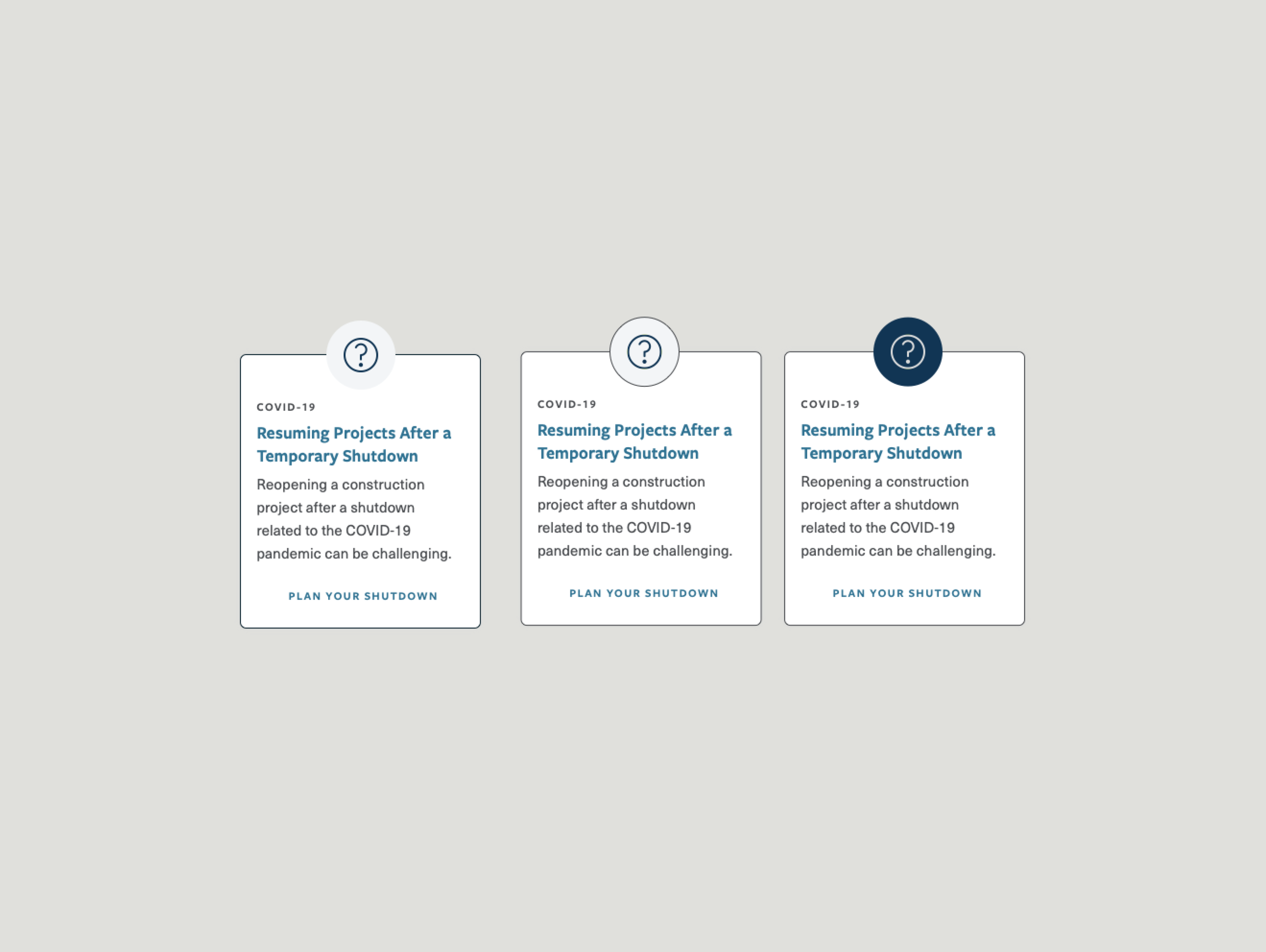
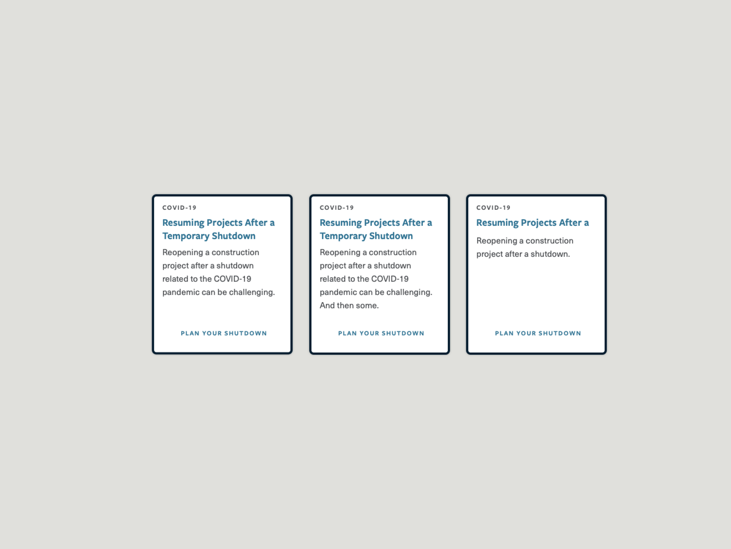
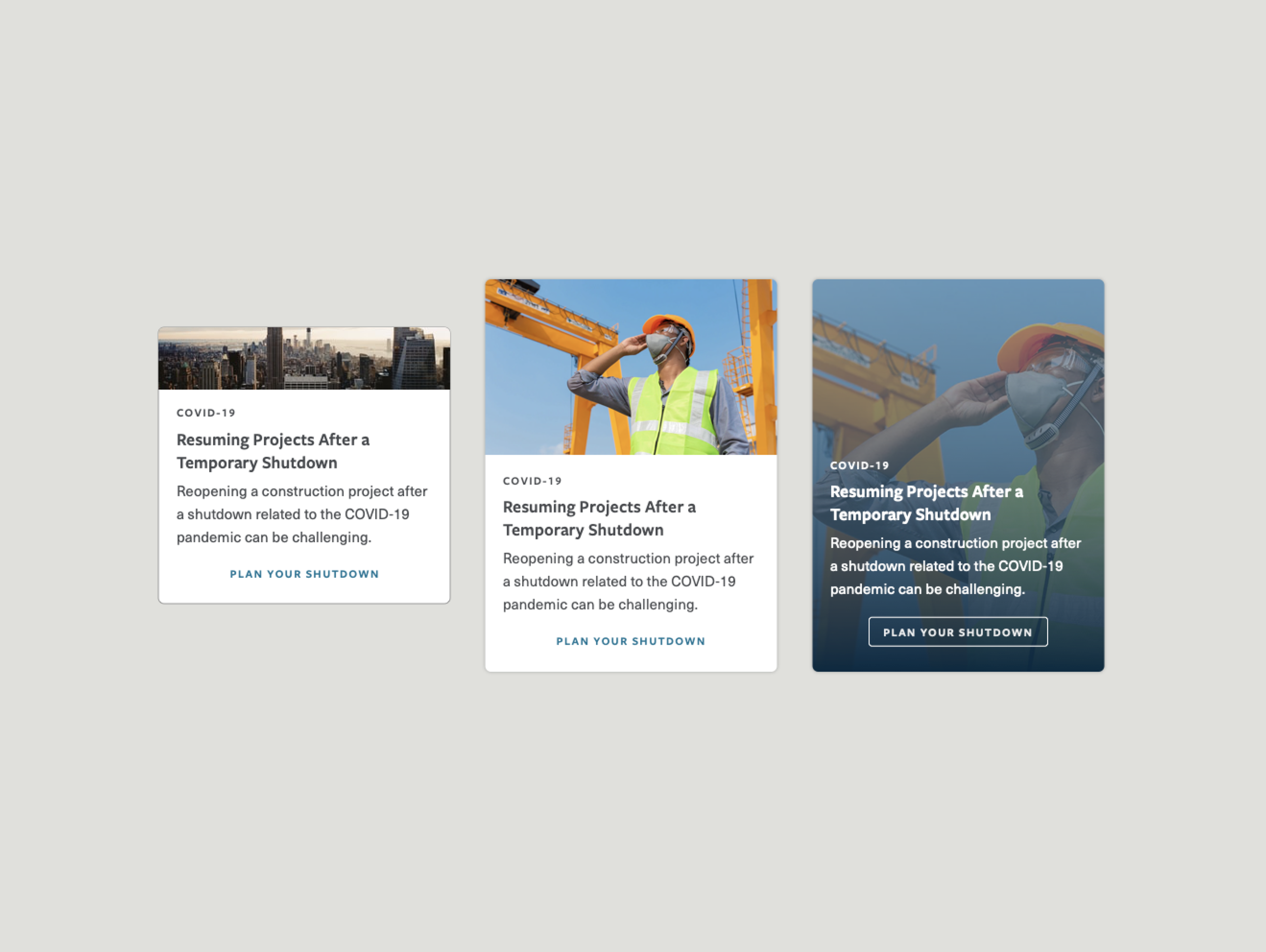
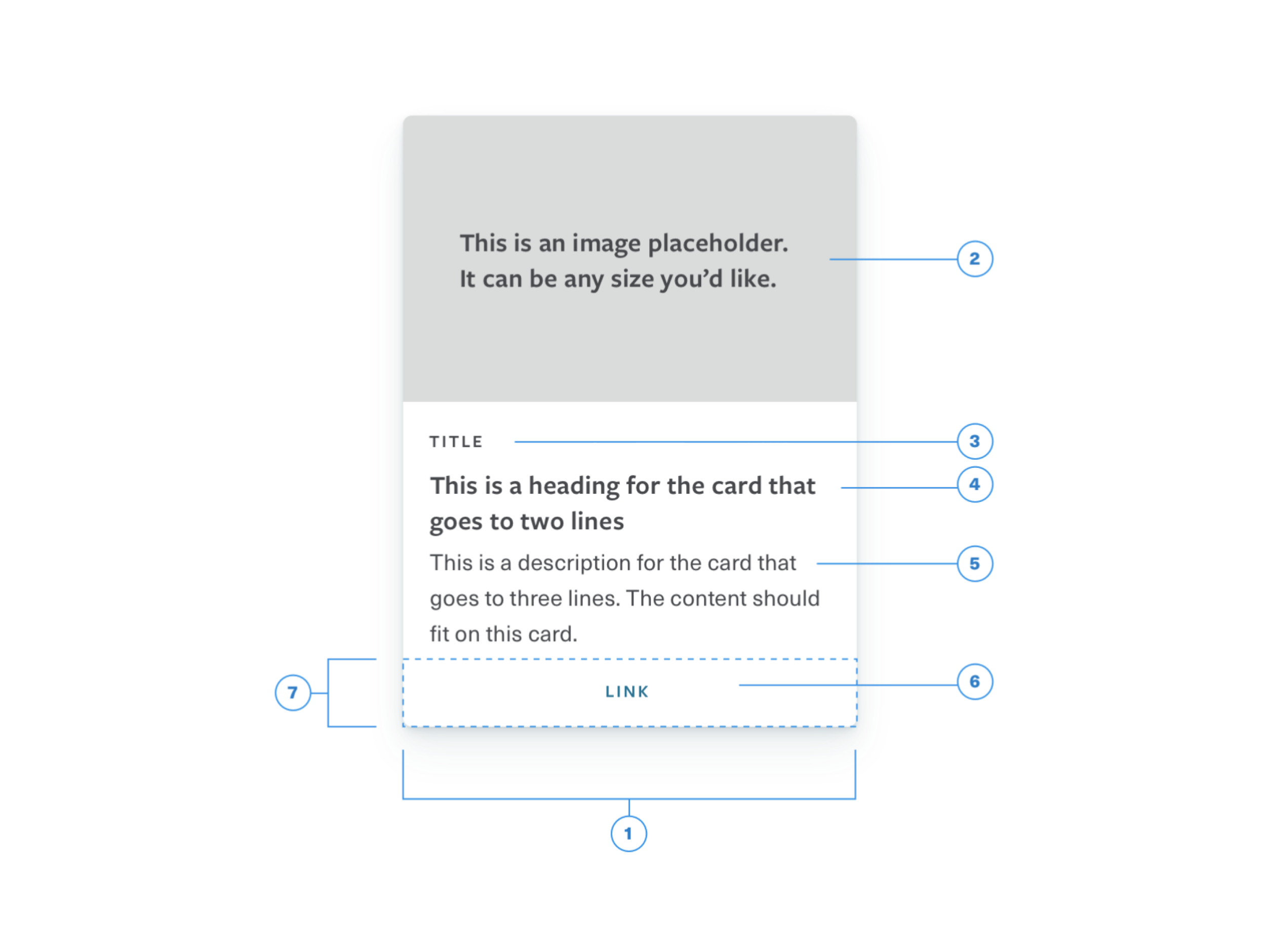
We started to see a common structure emerge during exploration. We found elements that could be added and removed depending on how much context a designer would like.
Drop shadow exploration
Many of the cards already in the enterprise were visually light in color. We decided to stay with that aesthetic and revisit different color cards as an enhancement in the future.
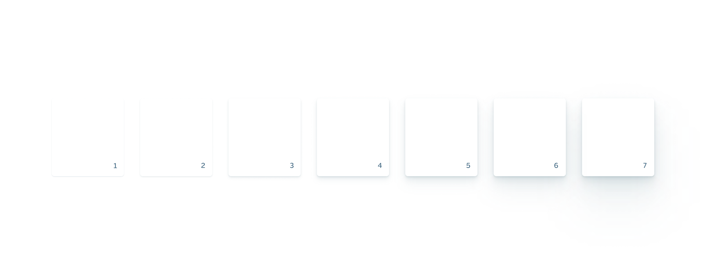
I then explored an elevation system that could be applied to not only cards, but other patterns as well.
The number of soft drop shadows applied to an element depends on its level (i.e. the seventh level has seven drop shadows applied to it.) Cards are at the fifth level, while a modal would be at the seventh level.
Drop shadows for every level; with a hint of blue
Customizing content cards
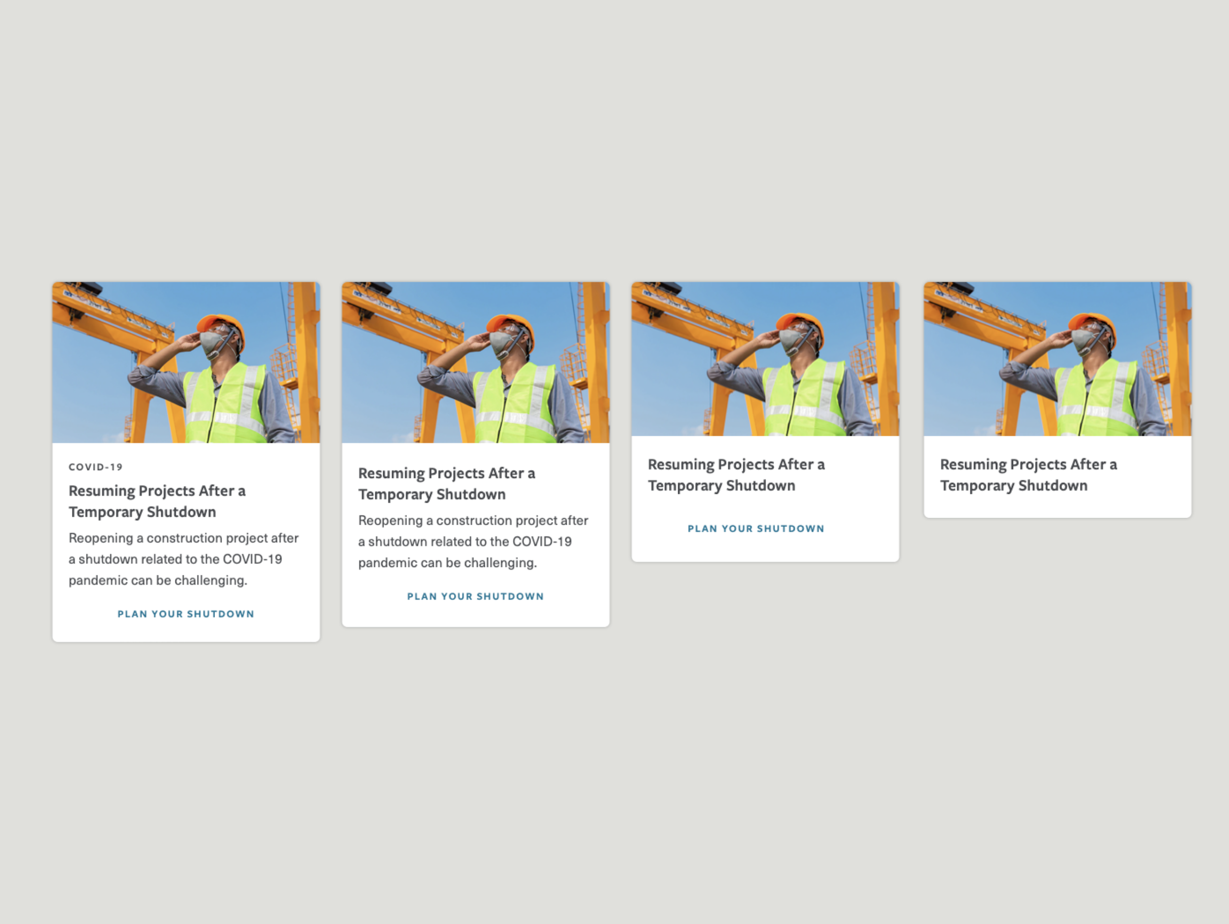
Launching three sizes of cards (small, medium, large) and allowing consumers to remove elements gives them many customized content card options.
Using research from the Pattern Canvas, guidelines were written to help designers determine how to use the pattern.
What came next
Consumers requested making the whole card container clickable so they can be used in a navigation instance.
On our list of enhancements are: alert styles within cards, different color backgrounds and cards geared with a specific purpose (e.g. contact card).
A developed elevation system using the visuals from above is upcoming.
